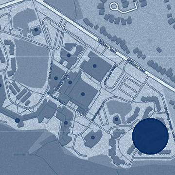
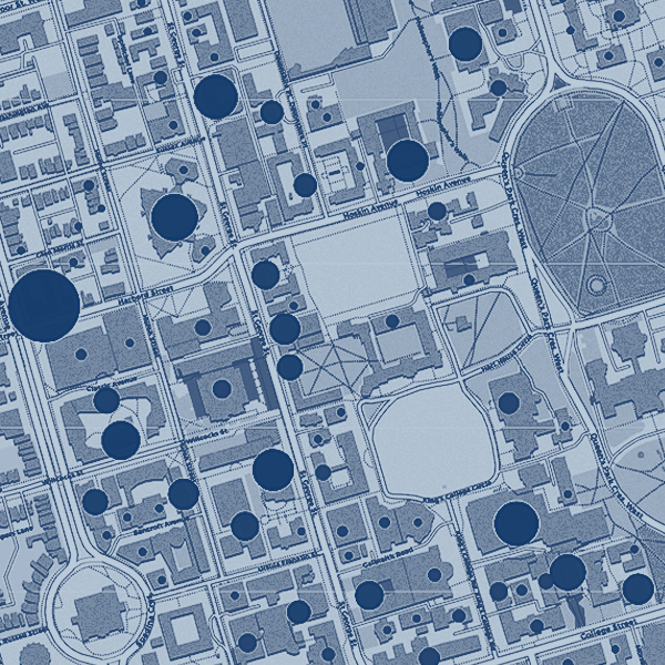
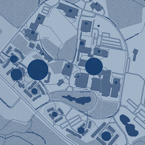
The following maps show, in real-time, the number of active wireless users connected to the campus wireless network.
On each map, the number in the circle represents the number of active wireless users in that building. The size of the circle increases or decreases based on the number of users in the building. Clicking on a building on the campus map will select the building and allow you to see historical usage information.
Click on one of the links below to view the real-time usage map for a U of T specific campus.
UTORID login required to access usage maps.
University of Toronto St. George (downtown) campus
University of Toronto Mississauga (UTM) campus
University of Toronto Scarborough (UTSC) campus